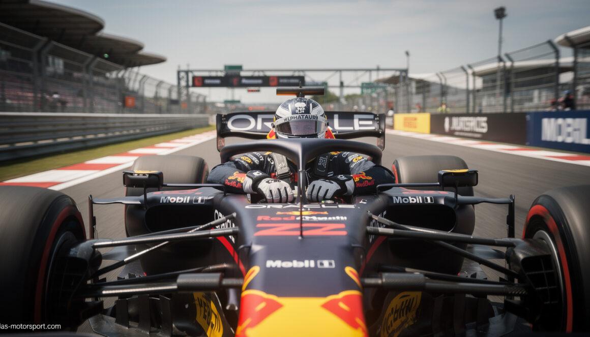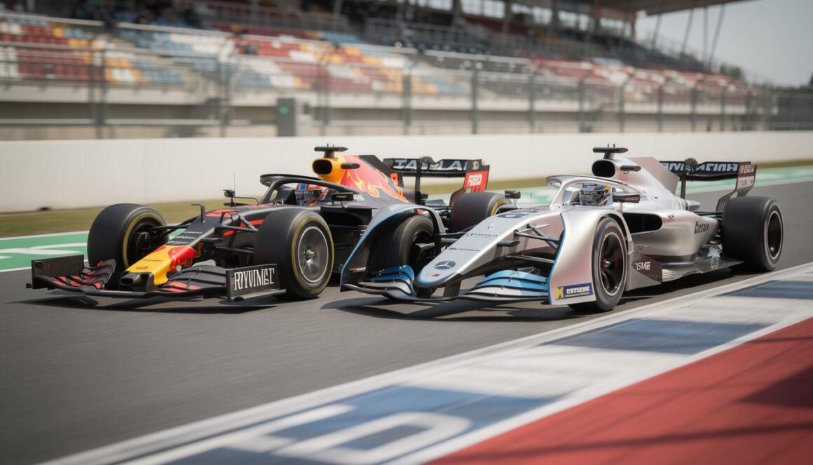


A circuit map compresses kilometres of asphalt into a tactical document. Its lines reveal braking zones, lateral load, overtaking chances, and tyre punishment. Reading those lines properly explains why identical cars can produce radically different lap times.
The shape matters as much as the distance. A tight street course rewards precision, while a flowing permanent circuit rewards aerodynamic stability. The start/finish line, corner sequence, pit entry, and DRS positioning each alter the competitive picture.
Circuit Maps: Understanding an F1 Track Layout
A circuit map is not merely a spectator graphic. It is a simplified engineering model of the venue. It shows where drivers build speed, lose energy, and place the car for the next demand.
Formula 1 circuits range from Monaco’s 3.337 km street layout to Spa-Francorchamps’ 7.004 km lap. That difference changes fuel mass, brake cooling, tyre energy, and gearbox usage. A short lap creates repeated traffic encounters during qualifying.
Track designers use radius changes to create different driving problems. A constant-radius corner lets drivers commit early. A decreasing-radius turn delays the apex and punishes premature steering input.
The map begins at the start/finish line, yet its real story starts earlier. The final corner determines straight-line speed and DRS effectiveness. A poor exit can cost several tenths before the timing beam.
Map symbols also reveal safety priorities. Run-off areas indicate likely overshoots and impact trajectories. Street circuits replace asphalt run-off with barriers, changing the driver’s acceptable risk level.
Modern circuit guides should distinguish permanent facilities from temporary city routes. Permanent venues often provide wider exits and deeper gravel traps. Urban layouts impose walls, cambers, drain covers, and narrow sightlines.
A useful map also identifies direction. Most Formula 1 circuits run clockwise, although several turn anti-clockwise. Anti-clockwise tracks load the neck and shoulder muscles differently through sustained left-hand corners.
Jeddah’s 6.174 km layout demonstrates why map length alone misleads. Its rapid changes of direction create sustained aerodynamic loading. Drivers need confidence before the circuit’s visual complexity becomes lap time.
The map becomes more valuable when paired with a guide to apex cornering and racing-line discipline. Geometry explains where the car should travel. Driver technique determines whether that theoretical route becomes a fast lap.
Every bend has consequences. A map therefore acts as the first setup sheet. It identifies where compromise begins before the car ever leaves the garage.
Corner Geometry and Racing Lines
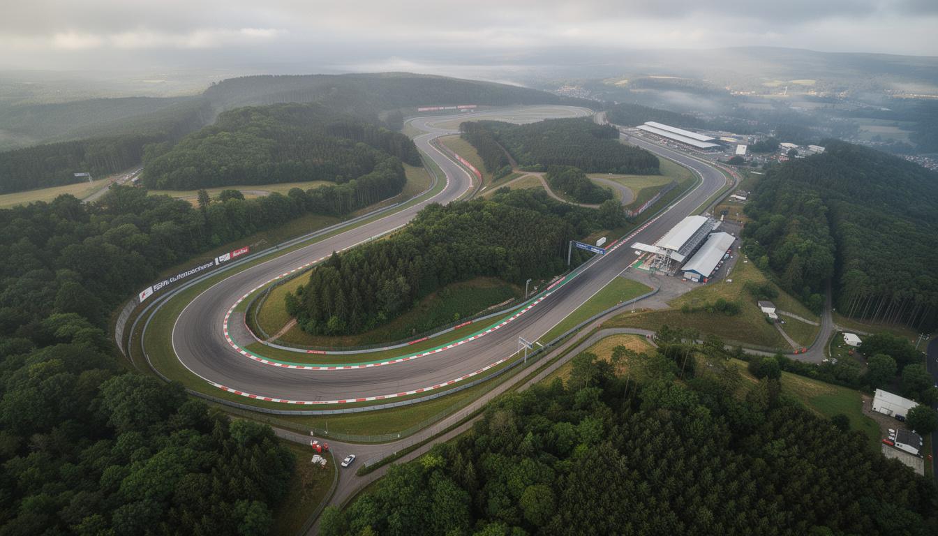
Maps show corner numbers, but numbers hide the important geometry. Drivers read entry width, apex position, and exit width first. Those features define the fastest usable steering path.
A late apex often sacrifices entry speed. It improves exit acceleration onto a long straight. That compromise matters most before DRS detection points.
Chicanes require two corners to be treated as one event. The first apex often becomes deliberately slow. The second exit determines the next acceleration phase.
At Monza, Variante del Rettifilo rewards controlled kerb usage. Excessive kerb contact unsettles the floor and rear axle. The driver must preserve traction for the following straight.
The 2026 FIA Technical Regulations reduce maximum car width to 1,900 mm. Earlier ground-effect cars measured 2,000 mm wide. Narrower machinery changes the visual margin available beside barriers and kerbs.
A narrow map does not always indicate a slow corner. Silverstone’s Copse appears simple from above. Its challenge comes from speed, load, and limited correction time.
Width creates tactical options. A broad entry permits multiple braking lines. A narrow entry makes defensive positioning easier and overtaking harder.
Drivers also study corner camber. Positive camber supports the tyre and increases lateral grip. Negative camber pushes the car towards the outside edge.
Track layout reading becomes practical during practice. Engineers compare the planned racing line against onboard evidence. Small deviations expose tyre limitations, wind changes, or balance problems.
The essential lesson is simple. A circuit map identifies the ideal path. It also exposes every place where that path can disappear.
Formula 1 Circuit Maps and Corner Data
Formula 1 circuit maps need more than a recognisable outline. They require speed categories, corner radii, elevation changes, and braking references. Without those layers, a layout becomes decorative rather than analytical.
Monza’s official lap record is 1:21.046, set by Rubens Barrichello in 2004. The circuit combines long full-throttle sections with low-downforce chicanes. Its visual simplicity hides demanding braking stability.
Suzuka is 5.807 km long and contains the distinctive Esses sequence. These linked corners create continuous lateral load. A map shows their shape, but telemetry confirms their physical cost.
The relationship between corners determines aerodynamic choices. Isolated hairpins reward traction and braking performance. Linked high-speed corners reward a stable platform and predictable floor airflow.
A car can lose time without any obvious slide. Small steering corrections increase front tyre scrub. That heat raises degradation during a race stint.
Corner order changes everything. A slow turn before a straight exposes traction weakness. A slow turn after a straight exposes braking instability.
FIA circuit licences require clear safety standards, yet layouts retain distinct identities. Monza asks for minimal drag. Hungary asks for front-end rotation and patience through repeated medium-speed direction changes.
Maps should also flag elevation. Spa’s climb from Eau Rouge through Raidillon changes load transfer. The crest reduces visible exit space while compressing the suspension earlier.
That compression affects ride height and plank protection. Modern underfloor cars lose performance when bouncing interrupts airflow. Engineers therefore balance aerodynamic load against mechanical compliance.
Formula 1 braking performance provides the next layer of map analysis. Heavy stops are not isolated red markers. They influence tyre temperature, battery harvesting, and defensive overtaking opportunities.
Maps become predictive tools. They explain why an apparently strong car can struggle at a particular venue. The shape dictates the questions that engineering must answer.
A video lap makes corner relationships easier to recognise before studying numbers.
Telemetry, Speed Traces, and Cornering Load
Telemetry turns a circuit drawing into measurable driver behaviour. Speed traces reveal braking points and throttle commitment. They also expose the hidden cost of corrections.
A smooth trace usually indicates controlled tyre slip. A jagged trace often signals wheelspin or instability. Those moments may cost only milliseconds individually.
At 300 km/h, each second covers 83.3 metres. A 0.10-second braking error therefore shifts the car 8.33 metres. That distance can destroy the intended apex.
Brake pressure traces show whether the driver reaches peak deceleration early. The best drivers release pressure progressively into rotation. This process is called trail braking.
Load transfer determines available grip. Heavy braking moves vertical load onto the front tyres. Steering too aggressively then overloads their limited grip capacity.
Throttle traces reveal exit confidence. An early but unstable throttle application can create rear tyre slip. A later application may produce better acceleration overall.
Engineers compare minimum speed through similar corners. A 3 km/h loss in a long-radius bend can persist. The lost speed reduces aerodynamic load and delays subsequent acceleration.
Corner maps and telemetry work together during qualifying. The map identifies where commitment matters most. The data shows whether commitment remained repeatable across laps.
For race strategy, that repeatability matters more than a single peak. A driver who protects the tyres gains later options. The circuit’s geometry decides where that protection is possible.
Fast laps need clean traces. A layout is the blueprint. Telemetry reveals whether car and driver have followed it accurately.
Track Layout Strategy: Pit Stops and Overtaking
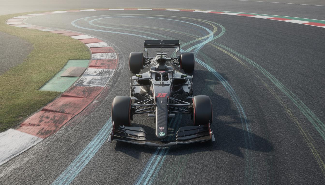
A map also determines the strategic value of pit stops and track position. The pit-lane route, entry speed limit, and rejoin location affect every tyre decision. A quick circuit can punish a stop more severely than a slow one.
Formula 1 pit lanes operate under an 80 km/h speed limit. The time loss includes deceleration, lane transit, tyre service, and acceleration. A map helps estimate where rivals will pass during that sequence.
At Monaco, track position often outweighs raw tyre advantage. Overtaking opportunities are restricted by narrow roads and short braking approaches. A strategically slower car can remain ahead for many laps.
By contrast, Bahrain has repeated traction zones and heavy stops. Tyre offset strategies can create genuine passing chances. Layout characteristics make degradation more useful than defensive positioning.
Maps identify DRS zones, yet DRS alone cannot create overtakes. The pursuing driver needs sufficient exit speed beforehand. That advantage usually begins two corners earlier.
Overtaking begins before braking. A driver may compromise one corner deliberately. The resulting traction creates a slipstream into the next braking zone.
Engineers therefore classify corners by strategic importance. Some turns produce headline overtakes. Others quietly determine whether the attacking car reaches that opportunity.
The Hungaroring illustrates this chain effect. Its final corner influences speed along the main straight. A poor exit reduces attack potential into Turn 1.
That is why maps should include pit entry and exit. An awkward rejoin can place cold tyres into a high-load sequence. The driver may lose more time than the stationary service suggested.
F1 pedal control matters when tyre temperatures reset after a stop. Brake and throttle inputs must rebuild energy without creating a slide. The layout decides how much time the driver receives for that task.
Strategy follows circuit geometry. The same tyre compound behaves differently when corner frequency, traction demand, and pit loss change. Maps provide the strategic framework before the lights go out.
Onboard footage shows why a braking zone only matters after the preceding exit.
Chicanes, DRS, and Defensive Positioning
Chicanes compress several decisions into a few seconds. Drivers brake, rotate, ride kerbs, and prepare traction immediately. Their map position can decide the entire overtaking sequence downstream.
A chicane before a DRS straight rewards exit stability. The defending driver protects the second apex. The attacking driver often sacrifices the first apex.
That approach creates a straighter exit path. It can deliver earlier full throttle. The car then carries momentum into the detection point.
Defence works differently at slow hairpins. The leading driver can cover the inside line. However, that defensive line may compromise the exit.
Exit speed creates passing pressure. The following car may avoid an immediate move. It can force the leader into a compromised defensive choice later.
Maps reveal whether alternate lines are realistic. Wide asphalt permits side-by-side braking. Narrow walls turn the same attempt into an unacceptable risk.
At Baku, the 2.2 km main straight magnifies exit errors. The narrow castle section creates a separate precision challenge. A single map contains both extremes.
Drivers use energy deployment according to these relationships. Deploying electrical power on a short straight may waste potential. Saving it for a DRS-enabled run can transform an attack.
Race engineers read map positions alongside live telemetry. They judge gaps, tyre state, and battery availability simultaneously. The best tactical calls anticipate the next two corner complexes.
Maps reveal the next move. They do not predict driver bravery. They define where bravery has a realistic chance of success.
Reading F1 Circuit Maps Through History
Historic layouts explain why modern circuit maps carry safety information. Older circuits often placed trees, buildings, and banking close to racing surfaces. Current FIA standards demand stronger protection around high-energy incidents.
Silverstone began as a former Royal Air Force airfield in 1948. Its broad fast corners still reflect that open origin. The present layout combines historic speed with modern run-off and barriers.
Monza’s track map includes remnants of the 1955 high-banked oval. That banking is no longer part of the Formula 1 Grand Prix route. It remains a physical reminder of a different risk calculation.
History sits beneath every kerb. Circuit evolution is rarely cosmetic. Changed chicanes, run-off areas, and barriers alter braking references and overtaking patterns.
Imola’s Tamburello became a chicane after 1994. The change reduced flat-out speed through a dangerous section. It also shifted the lap’s aerodynamic and braking balance.
A map from different eras should never be treated as identical data. Corner names may survive after geometry changes. Lap records must be assessed against the actual configuration.
The 2004 Monza lap record of 1:21.046 belongs to its specific rules era. Cars then used 3.0-litre V10 engines. Modern hybrid machinery produces power differently and manages energy through different systems.
Readers seeking power comparisons can examine how much horsepower an F1 car has. Peak output matters on straights, yet drag and corner exits remain equally important. Circuit maps show where that power can actually be used.
Historic analysis also corrects a common assumption. Faster lap times do not always mean a more difficult course. Regulation changes, tyre construction, safety geometry, and aero load can all reshape the result.
Configuration defines meaningful comparison. A circuit’s name may remain unchanged. Its technical question can change completely.
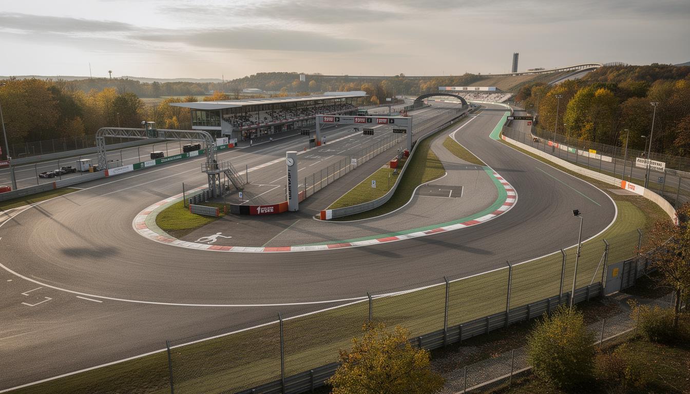
Historic Layouts and Engineering Compromises
The Williams FW14B showed how technology can change a circuit’s meaning. Its active suspension controlled ride height precisely. That capability supported consistent aerodynamic platform control.
In 1992, active systems helped drivers exploit kerbs and camber. Modern regulations ban active suspension. Current cars must find comparable stability through passive mechanical design.
A map identifies where platform control matters. High-speed direction changes punish vertical movement. Slow kerb-heavy complexes punish poor damping choices.
Historic machinery also carried different braking and tyre behaviours. Comparing eras demands caution. The route may be familiar, but the engineering problem is not.
Rules rewrite a circuit. The 2026 cars use active aerodynamics under new regulations. Their smaller dimensions target reduced drag and improved efficiency.
The published 2026 technical framework limits wheelbase to 3,400 mm. It also reduces overall width to 1,900 mm. These dimensions should improve agility in tighter sequences.
Yet reduced downforce changes braking and corner entry demands. Drivers may need more precise platform management. Circuit maps will highlight tracks where that adaptation matters first.
Madrid’s planned 2026 arrival has focused attention on new layouts. Fresh venues must balance overtaking, safety, spectacle, and logistical constraints. Those competing requirements always appear in the final geometry.
Debate around Madrid’s circuit design shows why map analysis matters before race weekend. A visual layout can suggest potential bottlenecks. Only running data will establish tyre behaviour and passing quality.
History improves future reading. Each revised corner carries an engineering reason. Understanding that reason turns a map into a record of Formula 1’s changing priorities.
F1 Track Layout Analysis for the 2026 Grid
The 2026 grid will read circuit maps through a different aerodynamic lens. Active aero modes will reduce drag on straights. Energy management will shape attack and defence more visibly than before.
Formula 1’s new cars are designed around reduced mass and reduced dimensions. The minimum weight target falls to 768 kg. That is 30 kg below the prior 798 kg benchmark.
Less mass changes every phase. Braking distances can reduce when tyre grip permits. Direction changes should require less steering effort and less tyre energy.
However, low-speed traction remains demanding. Electric deployment characteristics can expose rear-axle weakness. A map with repeated hairpins will test that weakness relentlessly.
Track layout analysis will therefore need new visual layers. Energy-harvesting zones matter beside DRS zones. Deployment windows matter beside traditional overtaking markers.
Long straights will not automatically favour the lowest-drag package. Cars must arrive there with stable battery state. The preceding sequence controls that electrical opportunity.
The 2026 rules also bring Manual Override Mode for attacking cars. Its effectiveness depends on track position and speed differential. Maps will show where extra electrical power can create a credible pass.
Efficiency replaces simple straight-line power. A car must harvest, deploy, and corner without overheating tyres. Circuit geometry sets the rhythm of that energy cycle.
Readers should assess three questions from every map. Where does the driver brake hardest? Where does the car need maximum traction? Where can an exit speed advantage survive?
Those answers explain why teams bring different wing levels. They also explain why a competitive order can move sharply between weekends. The map is a technical demand sheet, not a postcard.
Madrid practice coverage can add the missing live layer. First running exposes grip evolution, kerb aggression, and real braking distances. The circuit drawing then becomes a verified performance model.
Maps remain the first evidence. Data refines their meaning. Drivers and engineers still begin with the same question: where will this lap be won?
How Drivers Build a Lap from a Map
Drivers begin their preparation before their first installation lap. They study reference points and likely wind exposure. The map establishes the lap’s mental sequence.
Turn numbers help radio communication under pressure. Engineers can report a problem precisely. Drivers can adjust brake balance before a known corner.
Visualisation also reduces cognitive load. A driver rehearses entries, apexes, and exits mentally. That preparation preserves attention for changing grip conditions.
Maps cannot show every bump or kerb vibration. Simulator work adds those missing sensations. Track walks then verify surface details.
Preparation saves driving capacity. At high speed, delayed recognition creates immediate losses. A familiar sequence supports smoother inputs and better tyre management.
During qualifying, a driver may alter only two points. A later brake release can improve rotation. A different kerb strike can unlock earlier throttle.
Such changes become measurable through telemetry. The quickest solution is not always the most aggressive-looking one. It is the line producing the highest exit speed.
During races, maps guide traffic management. Drivers avoid dirty air in selected turns. They prepare battery use around the next realistic overtaking location.
The strongest map reading combines geometry with conditions. Wind, temperature, grip, fuel mass, and tyre age alter the ideal approach. The underlying shape remains the reference.
A layout rewards informed precision. The best laps look simple because preparation has removed unnecessary decisions. Circuit maps are where that preparation begins.
What does an F1 circuit map show?
An F1 circuit map shows the course direction, corner sequence, pit lane, start/finish line, and often DRS zones. Better maps also identify elevation changes, braking zones, and strategic corner combinations.
Why are circuit maps important for lap times?
The layout determines braking demand, tyre energy, aerodynamic requirements, and traction zones. Drivers use the map to build racing lines and engineers use it to select setup compromises.
What makes a chicane important on an F1 track layout?
A chicane combines braking, kerb usage, rotation, and traction into a short sequence. Its exit can determine speed into a DRS zone or the next overtaking opportunity.
How do 2026 Formula 1 rules affect circuit analysis?
The 2026 cars are narrower, shorter, lighter, and use active aerodynamics. Analysts must consider energy deployment, reduced drag, and altered cornering behaviour alongside traditional map features.